The cryptocurrency market can seem difficult to grasp, particularly when it comes to understanding crypto market charts. It can be challenging to determine the market’s underlying trends at first glance or if you don’t know where to look. Even worse is the uncertainty of wavering between several assets without a clear method for making rational decisions.
In this article, we’ll explore some important crypto market charts to provide an overview of the cryptocurrency market. By filtering certain parameters, you’ll be able to study the market more globally.
Moreover, technical analysis can be applied to all these charts. While these benchmarks are not an exact science, they will make it easier for you to understand the ongoing battle between buyers and sellers.
Bitcoin, the king of cryptocurrencies
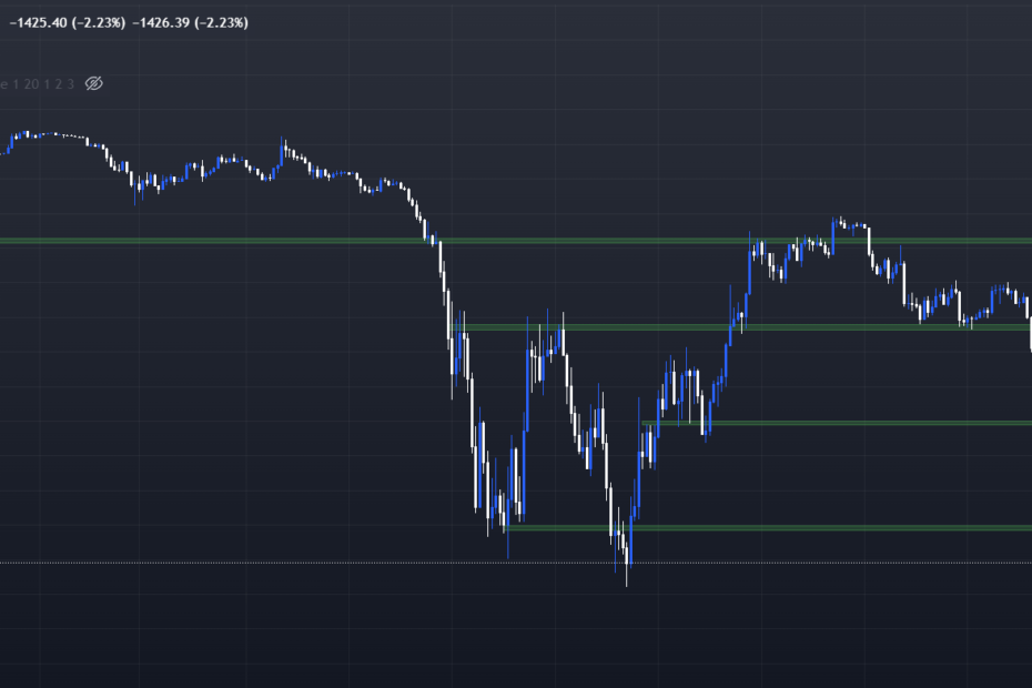
Unsurprisingly, the first chart to watch regularly to understand the crypto market is that of Bitcoin. As the most popular and capitalized crypto, it sets the pace for the entire market. In theory, if $BTC is on an uptrend, altcoins will follow suit. It’s important to understand that, as the most highly-capitalized crypto, Bitcoin is less volatile than the rest of the market. Which means that during bullish periods, other, less-capitalized alts will be able to outperform it quite easily. On the other hand, the reverse is even truer: when $BTC falls, altcoins are generally even more affected, and their declines will be even steeper.
Reversed Bitcoin: 0-BTC
The second highly relevant chart to add to your watchlist is none other than Bitcoin’s inverted chart. To find it in Tradingview, simply add “0 -” in front of the symbol. Analyzing this chart with a neutral eye is a very effective way of erasing any bias, bullish or bearish, that you might have when looking at the main chart. Indeed, if you think the Bitcoin chart is bullish, but the inverse chart is bullish too, it means you’re experiencing a bullish bias somewhere in your chart readings because your analyses are contradictory.
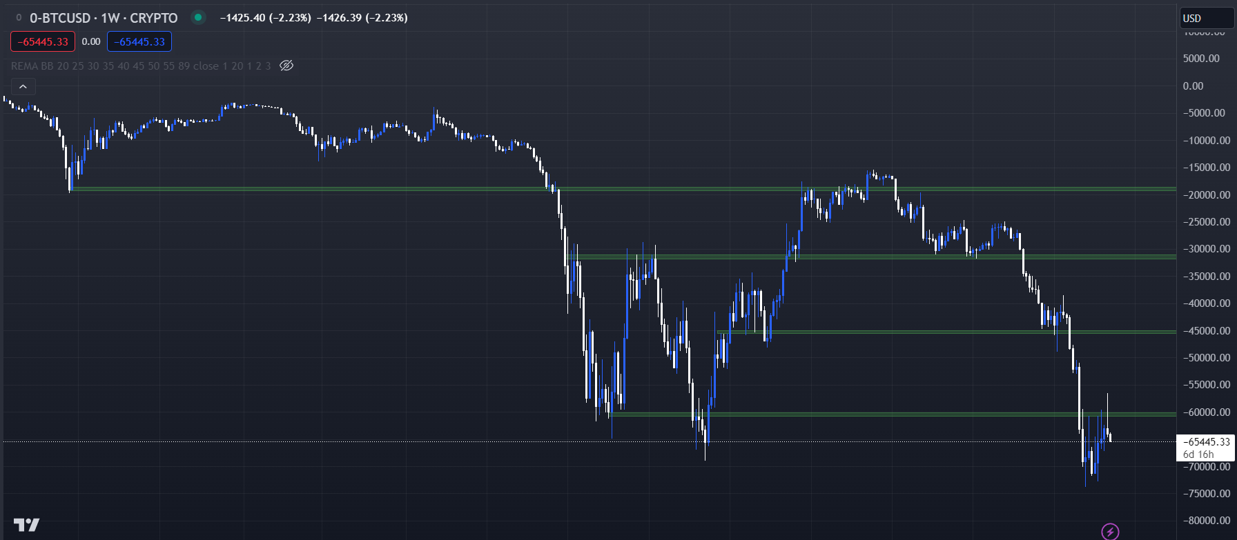
Not letting your emotions get in the way when you trade/invest is very difficult, but one of the most important things for long-term profitability. So try to analyze these two charts with a neutral eye, and your analysis of the market will be all the more accurate. With experience, you’ll understand that you’ll always find bullish indications if that’s what you’re looking for, just as if you’re only looking for bearish indications you’ll always find them. Good news: the mechanism for inverting graphics by adding “0-” works with all symbols.
Dominance Charts for Bitcoin and Ethereum : BTC.D & ETH.D
Dominance charts are very useful for anticipating the outperformance of Bitcoin or Ethereum over the rest of the crypto market. These two charts calculate the share that Bitcoin or Ethereum capitalization represents of the total crypto market capitalization. If the dominance of Bitcoin (BTC.D) is bullish, this means that, in general, $BTC attracts more liquidity and will outperform the altcoin market. The same applies to the ETH.D chart. Be careful, though: if BTC.D looks bullish, this doesn’t mean that BTC will necessarily go up. It could also go down, but less than altcoins, which would increase its dominance on the market. These charts therefore give no direction for the unit price of BTC and ETH.
Ethereum VS Bitcoin : BTC/ETH
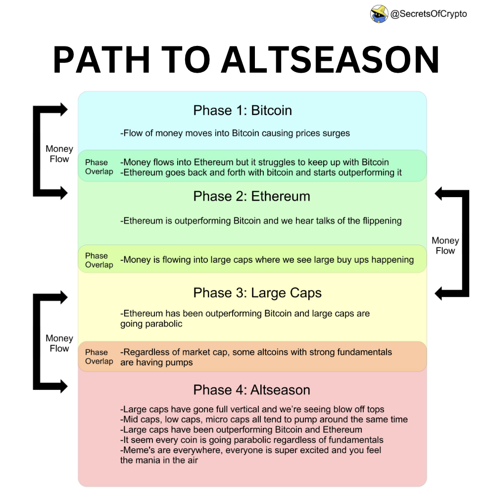
We understand that Bitcoin leads the crypto market, but can outperform it during certain phases; you can detect these phases thanks to the BTC.D chart. As for ETH, it has an even greater impact on the Altcoin market, so it’s interesting to be able to compare Ethereum and Bitcoin directly. To do so, simply observe the ETH/BTC chart, which will tell you whether the king of altcoins, ETH, is attracting more investors and more likely to outperform Bitcoin.
This will help you determine the cyclical phase the market is in. Over the years, we have observed a cyclical pattern of liquidity rotation:
Altcoins VS BTC : Alts/BTC
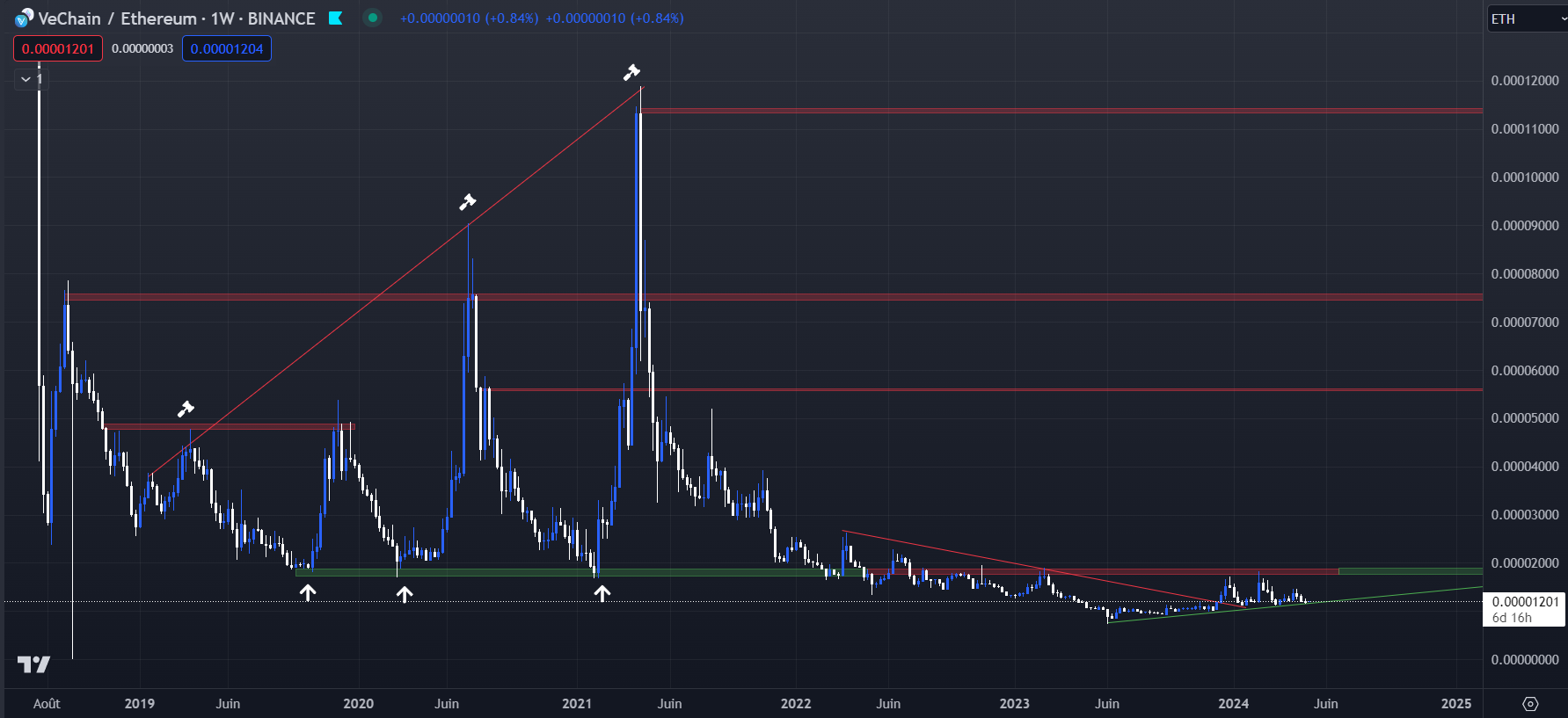
So, should you invest in altcoins, or BTC, or ETH? You can find the answers to your questions simply by analyzing your altcoin against Bitcoin, or Ethereum by looking for Alt/BTC or Alt/ETH charts. For example, you’ve heard good things about the VeChain project and its $VET crypto, but you’re not sure whether you should buy it instead of Bitcoin. Analyze the VET/BTC chart. If your analysis tells you that the chart is bullish, this means that you think VET will outperform BTC. The same goes for the VET/ETH chart.
On the other hand, if these graphs are bearish, it means that the opposite crypto will probably be a better investment than VET, or at least that they will be more resistant to market downturns. This principle also works when comparing two altcoins: if you’re hesitating between VET and CHZ, you can analyze the VET/CHZ and CHZ/VET graphs to help you make an informed decision.

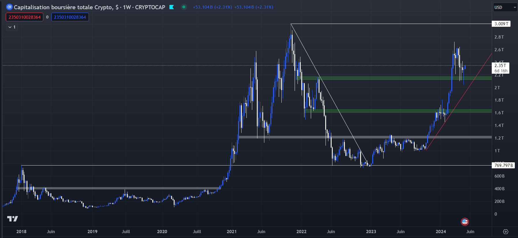
TOTAL, TOTAL2 et TOTAL3
These charts all represent total market capitalizations of the crypto market. The first, TOTAL, represents the capitalization of the absolute entire crypto market, taking them all into account, and is therefore highly relevant for understanding the evolution of the market in its most general form. TOTAL2 represents the total capitalization of the crypto market excluding BTC, in other words, the total capitalization of the altcoin market. And TOTAL3 represents the total capitalization of the altcoin market excluding ETH.

Market Cap Charts
Between cycles, investors can get caught up in the hope that their cryptocurrency will make another All Time High. But in the meantime, the token in question may have undergone heavy inflation, significantly lowering its price upside potential. You could look at the price chart and see that it needs a 10x to get back on its all-time highs, but what this chart can’t tell you is whether there are more tokens in circulation than before, and when you look at the Market Cap chart, you could see that the capitalization record is only 5x upside, for example. That’s why it’s important to observe both charts. You can find them easily on Tradingview by searching for “Market Cap BTC”, for example.
USDT Market Cap & USDT Dominance (USDT.D)
The last two charts giving us key information on the crypto market relate to USDT; the most capitalized and widely used stablecoin. Looking at the USDT Market Cap gives us an idea of the trend in stablecoin issuance. In times of market interest, new investors enter the market, and to meet this demand, Tether must issue ever more tokens. On the other hand, if this graph stagnates or falls, it means that it’s a period of disinterest, and many players are exiting the crypto market altogether.
Finally, the USDT dominance chart. This chart is the best for understanding whether market players want to buy cryptos or sell them. USDT is the most widely used stablecoin and when investors take profits, they sell their cryptos to buy USDT, which will increase its dominance.
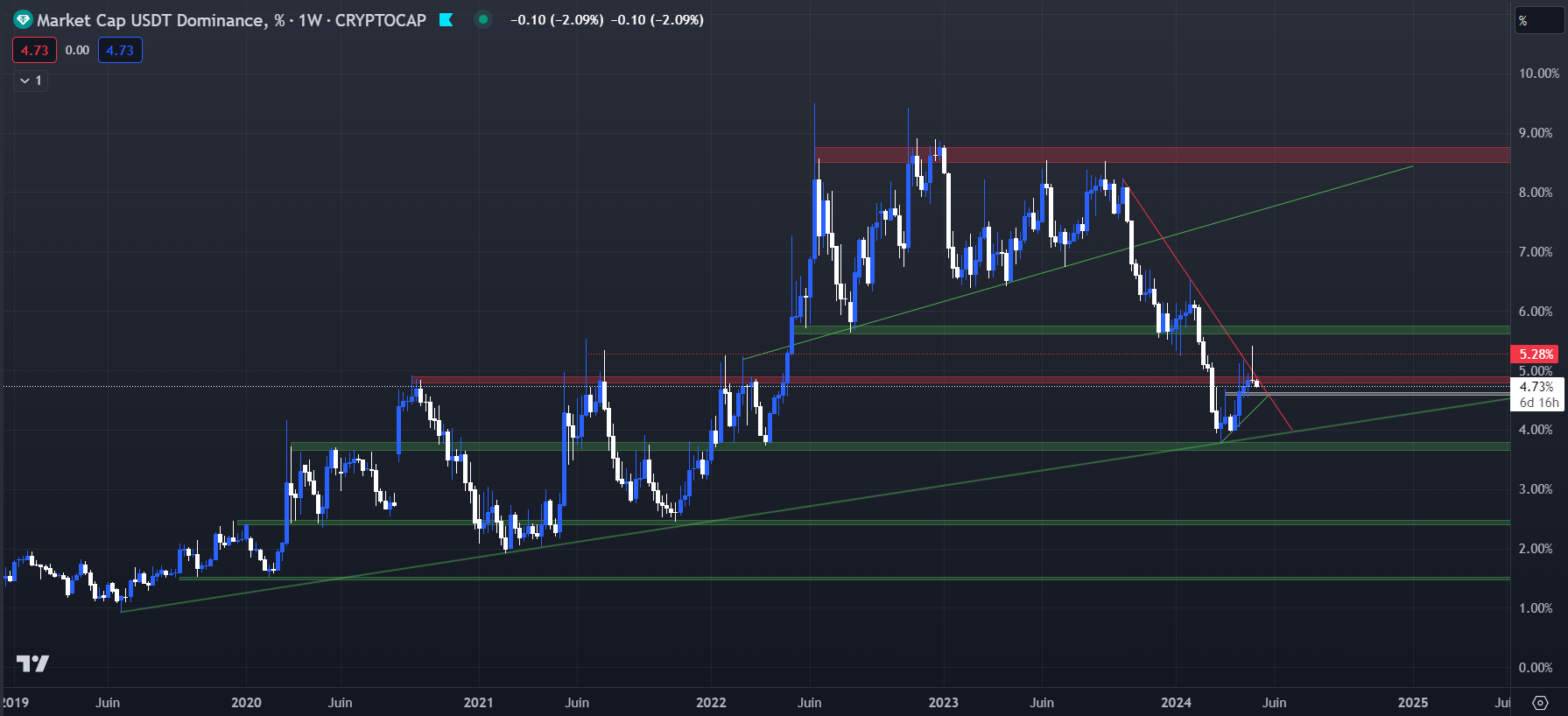
So keep an eye on this chart and understand that when its dominance falls, it means investors are selling their stablecoin to buy cryptos, so you could benefit from a bullish trend on BTC and altcoins. Conversely, when its dominance rises and breaks key levels, it’s best to remain extremely cautious and consider placing Stop Losses on your positions.
By combining the analysis and monitoring of all these charts, you’ll be able to understand the crypto market accurately and become able to anticipate future trends to best maximize your investments and optimize your returns.